ShopDreamUp AI ArtDreamUp

Deviation Actions
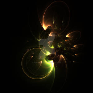
A Long-Time Space Mantis Lost Vinyl
The Lost Mantis Vinyl is firstly a collection of several original fractals that I've created over the years and never released, for a reason or another, and which I have decided to release publicaly. I'll add more on a regular basis.
These artworks are not all esthetic in nature, but may often carry a high level of symbolism and meanings.
You will find here fractals created over 20 years long period, using several fractal softwares.
$14/month


Suggested Deviants


Suggested Collections


You Might Like…


Comments13
Join the community to add your comment. Already a deviant? Log In
Hm.. I really like this. It's a big improvement from your last pixelart dealy-thingamabobber. Ok some points:
-shadow is good... but blur is not. there is no anti-aliasing in pixelart, if you want to smooth out the shadow, use dithering my friend") Otherwise, make the shadow opaque with no other colors around the edges... looks sharper
Otherwise, make the shadow opaque with no other colors around the edges... looks sharper  (Wink)")
-I like the no outlines, I personally dont really care about outlines as long as the pixelart piece looks good in the end... and you pulled it off here. but usually when I'm making pixelart, outlines help me visualize the piece before I've colored it. but I try not to make them black, colored outlines are always good, so that the object is a little contrasted from the background (Smile)")
-When I zoomed in I noticed a little bevels along the edges... I know you love antialiasing but in pixelart non-antialised looks good.
-In the corner of a cube or whatnot, I always like to put a llittle brighter highlight 1 px by 1 px, just to contrast the corner and make it look better. Might help here.
-Colors are good choice. Rich, vibrant, full-of-life. Love em. Maybe you could focus these color into a building of some sort, possibly a block to go in pixeldam
That's all the crits I have for now, keep the pixelart comin you're a natural
-shadow is good... but blur is not. there is no anti-aliasing in pixelart, if you want to smooth out the shadow, use dithering my friend
-I like the no outlines, I personally dont really care about outlines as long as the pixelart piece looks good in the end... and you pulled it off here. but usually when I'm making pixelart, outlines help me visualize the piece before I've colored it. but I try not to make them black, colored outlines are always good, so that the object is a little contrasted from the background
-When I zoomed in I noticed a little bevels along the edges... I know you love antialiasing but in pixelart non-antialised looks good.
-In the corner of a cube or whatnot, I always like to put a llittle brighter highlight 1 px by 1 px, just to contrast the corner and make it look better. Might help here.
-Colors are good choice. Rich, vibrant, full-of-life. Love em. Maybe you could focus these color into a building of some sort, possibly a block to go in pixeldam
That's all the crits I have for now, keep the pixelart comin you're a natural